
Freedom Worship Center (Branding)
I was excited to hear from Devin when he called about a branding package for Freedom Worship Center. He serves as their sound engineer and is close with the decision-making team and thought I would be a good fit. We had an in-depth talk about the current state of their visuals and what they wanted conveyed with the new look. Devin said they wanted something modern but also warm and welcoming. Christian iconography (crosses, doves, etc) wasn’t a must-have, but it also wasn’t off the table so I got to sketching to see how many ideas I could get down. Being raised in the Bible-belt, I’ve seen about a thousand different ways to brand a church and knew coming up with something fresh wouldn’t be easy!
Favorite Sketches

After throwing a few ideas around, we decided a capital “F” would be the best as their logomark.
First Drafts
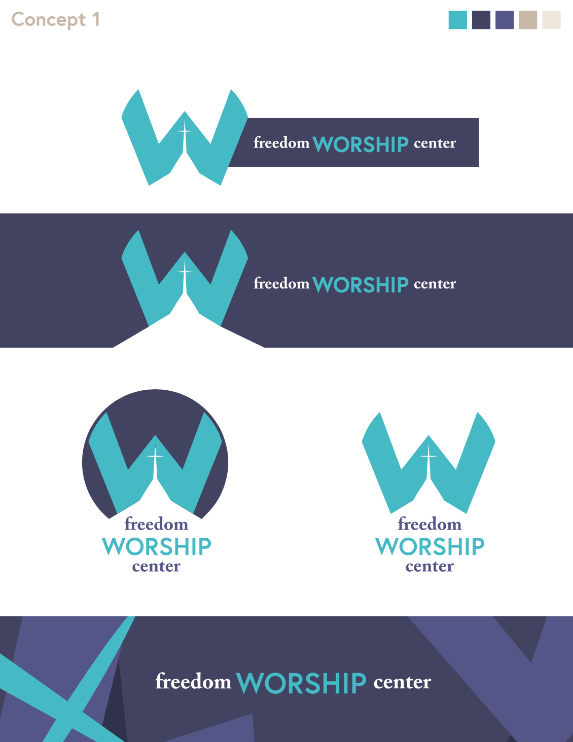


I gave FWC three concepts to mull over. The first was the most modern, with sharp clean lines and a punchy color scheme. The second a little more traditional, with an added sense of “unity” and inclusion via the mosaic pattern and earth tones. The third was more of a “sanctuary” vibe, but warm and welcoming with curved edges and a rich, peaceful teal. Ultimately, they wanted to blend the design of the third with some of the warm neutrals from the second, resulting in the final brand set below!


This project was a lot of fun and a good change of pace from the work preceding it. It’s always fun when a client needs lots of extra deliverable like tshirt designs, printed media, and digital graphics because we can really see the brand start to come to life!